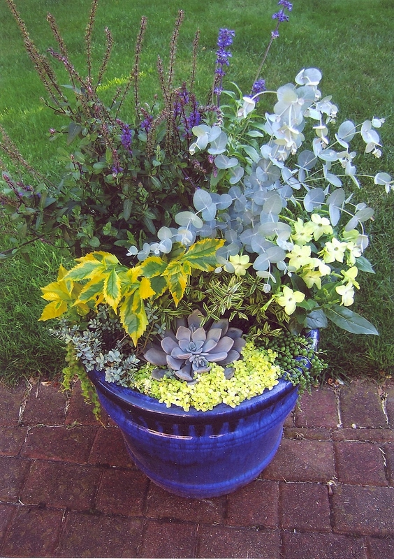
Container Contest
1st Place - Sharon Seki

Container Contest
2nd Place - Linda Turnbull

Container Contest
3rd Place - Audrey Barnes
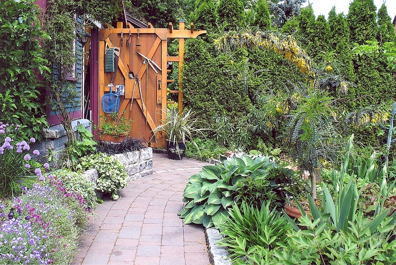
A Garden View
1st Place - Audrey Barnes
This very good image has a strong composition and high viewer interest. The brick path allows the viewer's eye the chance to wander along until it reaches the shed door and the interesting hanging tools which are placed in a perfect spot in the frame. The exposure is even throughout and the focus good front to back. Well Done!
A Garden View
2nd Place - Linda Turnbull
In this appealing image I find myself wanting to see the whole garden as the colors and textures of the plants are very pleasing. The exposure is good and the focus is very good throughout the image. There is a diagonal across the frame from the lower left to the upper right with the gradual increase in height of the plants. This makes for a very strong image and a beautiful garden.
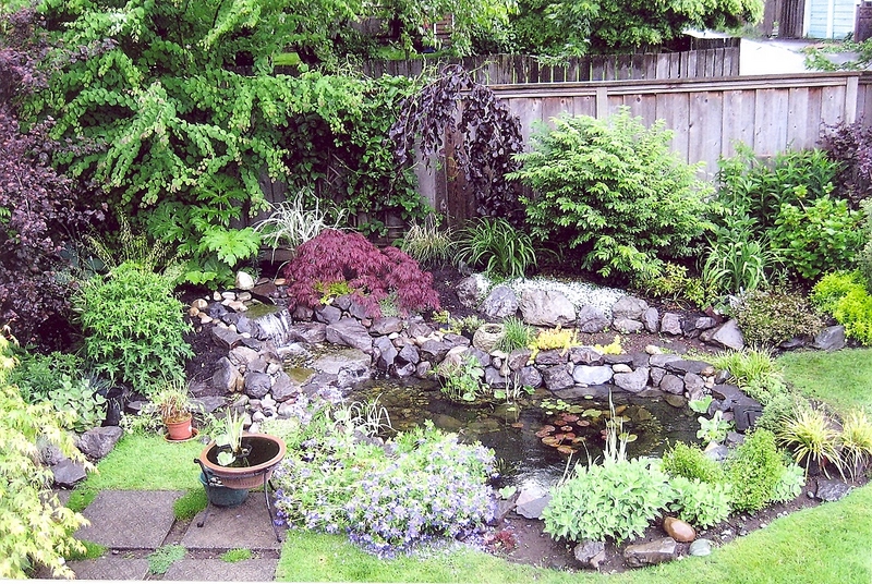
A Garden View
3rd Place - Louise Melville
This image shows a delightful corner of someone's garden. The composition is good with tall plants on one side giving way to a waterfall and ending in the pond at the other side. A nice flow for both the water and the viewer's eye. The focus is good in this image but it is slightly over exposed mainly in the plants near the bottom edge of the frame. This could be changed by using a polarizing filter on the camera to reduce these bright highlights. The photographer could also try increasing the color saturation on the home computer or ask the printing lab to make another print with more color saturation. While this may seem like a lot of work to go through for one print it would make a considerable difference if this image was to be enlarged.

Visitors in the Garden
1st Place - Trudy Findlay
The creature enjoying this garden happens to be a green frog, one of my favorite subjects. This frog is well lit and very well focused in this image. A slight shift of camera angle would have moved �our� frog out of the center of the frame which often makes an image stronger.

Visitors in the Garden
2nd Place - Audrey Barnes
This very strong image has great composition with the positioning of the cat in the frame. The slight angle of the cat's body and the curve of it's tail give added interest . The viewer is also intrigued because we can't see what the cat is looking at. The exposure is good in this photo. While cat's upper back is in focus much of the rest of it is getting soft. This image would have been exceptional if the entire cat was in sharp focus. To do this would require shooting with a very small aperture (f22) to get more depth of field and using a tripod because of the longer shutter speed needed for this f stop. Not so easy to do with an unpredictable subject like a cat but worth a try if your cat likes to hang out by the gate occasionally.

Visitors in the Garden
3rd Place - Diane Escalante
This image has the strong color of the flower and the excellent detail of the mason bee's back as it's main features. The exposure is quite good considering that the day was sunny and the depth of field is very good. This simply means that the subject is in sharp focus and the background is acceptably blurred. This image would have been even stronger if the subject wasn't so centered.
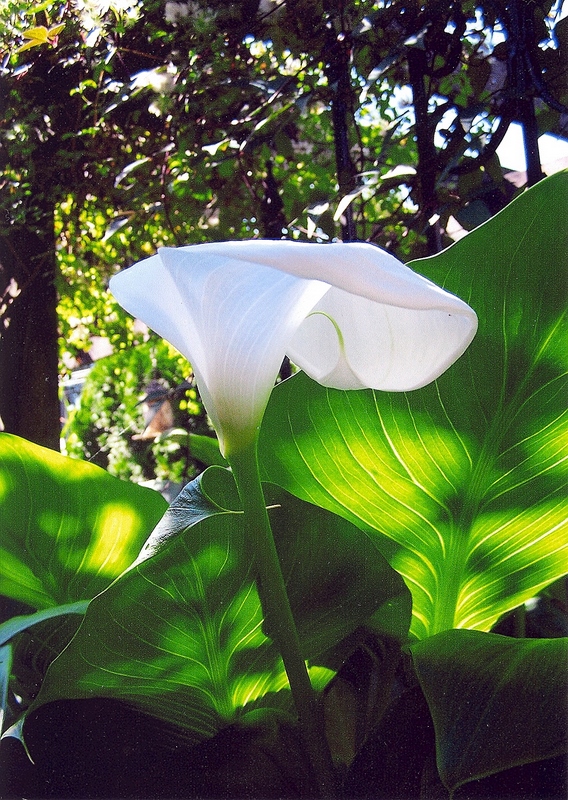
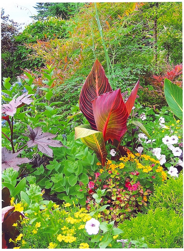
Garden Colour
1st Place - Linda Turnbull
This image of a white Calla Lily with the large leaves backlit by spots of sunlight seemed to capture the interesting shape of the flower and the structure of the leaves especially well. The composition is good and although areas of the image are in deep shade the important parts are visible. Actually, the uneven spots of sunlight add to the appeal of this photo. The flower and leaves are in focus and the background is blurred so it doesn't distract from the subject.
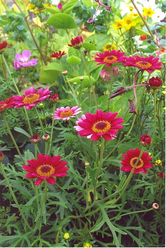
Garden Colour
2nd Place - Audrey Barnes
This image is a more traditional 'color in the garden' shot with a well focused grouping of small red and yellow flowers. The lighting is even and pleasing. The photographer could have improved this nice image a bit more by cropping the bottom edge of the image to remove the 2 small blurry flower buds and to crop out the white and yellow blurry flowers at the top edge. The brightness in these 2 areas is a minor distraction that can pull the viewer's eye away from the main subject.

Garden Colour
3rd Place - Ann Paisley
This winter image has lots of interest for the viewer because it is so different. The snow gives the light in this image a delicate softness allowing us to see texture in the nearest snowflakes and the muted color of the red berries. The curving branches of the tree also add interest. A slight shift in the camera angle so that the berry clump at the left was not being clipped may have made this photo even stronger.