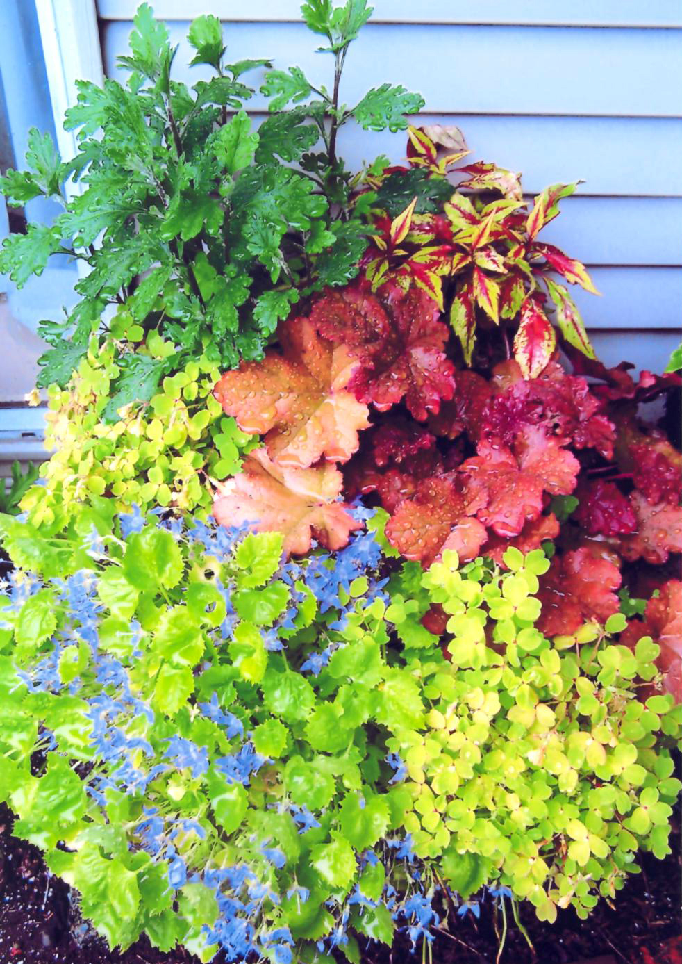
Container Contest
1st Place - Linda Turnbull
Container Contest
2nd Place - Sahron Seki

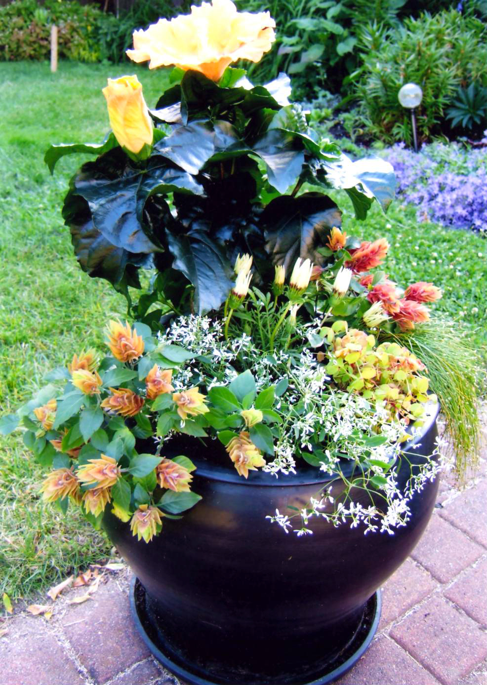
Container Contest
3rd Place - Linda Turnbull
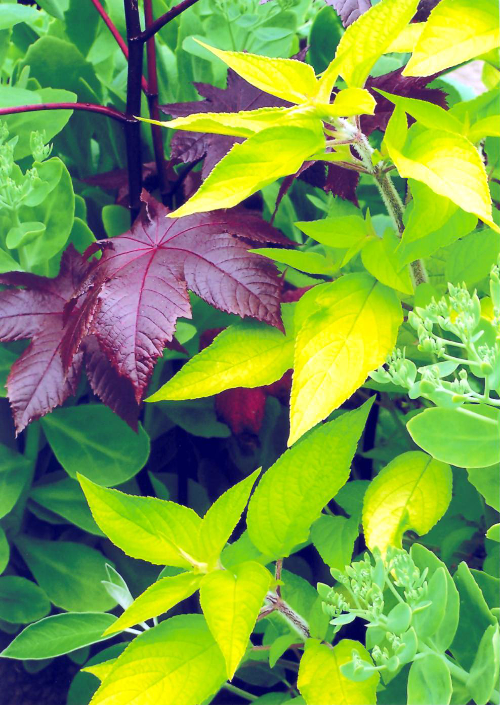
View of a Garden
1st Place - Linda Turnbull
This is a beautiful study in form and colour. The greens and yellows are delicate and fresh, and create such a lovely contrast to the rich purple tones of the main subject. Composition is well thought out: the yellow tones make a pleasing diagonal sweep through the image, and help to define the light gradient across the frame.
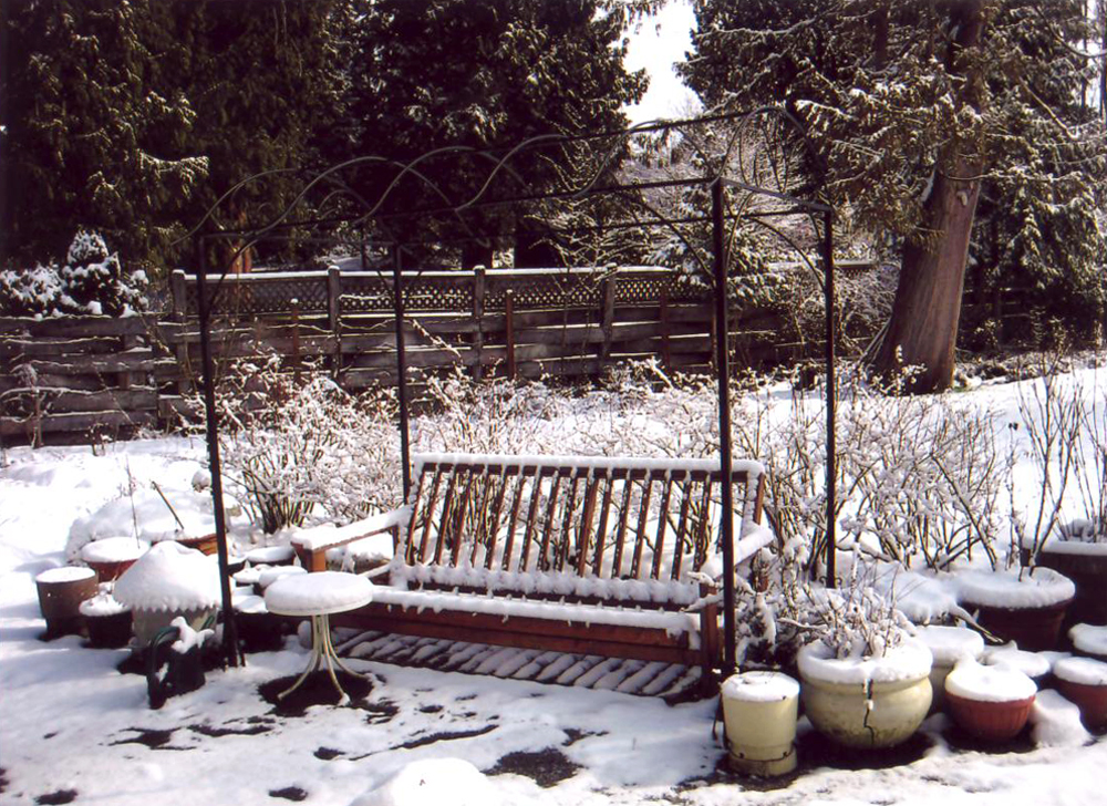
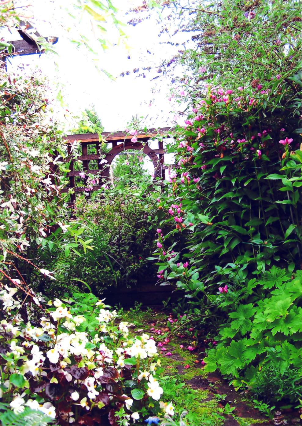
View of a Garden
2nd Place - George Nakatsu
This snow scene has so many interesting and pleasing elements. The partially melted snow makes a dappled pattern on the ground and trees and puts the viewer in mind of potential spring when this lovely bench and its surroundings will make a wonderful resting place. The cracked pot on the right is another reminder of the ravages of winter. The composition creates a visual flow back and to the right in the frame, and the large cedar tree makes a solid convergence point. In choosing to shoot this bench and frame at an angle the photographer did well to add a dynamic element to the scene.

View of a Garden
2nd Place - Diane Escalante
This is a beautiful garden that is abundant in colours, tones and textures. The two groupings of red tulips create some focus, as do the lines defined by the yellow foliage. Exposure is good, and the colours natural and rich. Compositionally, this photo may have been stronger moving slightly to the right, where it feels like we might be missing some of the yellow leaves that would pair nicely with the prominent cluster in the centre, as well as reducing the empty space on the left margin. This may also serve to make the brickwork and planter in the lower right more of a visual focus that would provide contrast to the natural patterns in the rest of the frame.
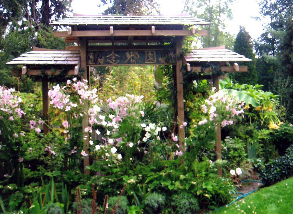
Garden Design
1st Place - Linda Turnbull
Garden Design
2nd Place - Silina Nakatsu

Garden Design
3rd Place - Linda Turnbull

Visitors in the Garden
1st Place - Diane Escalante
This is a very fine study in detail and colour. The butterfly and the flower it is resting on are both in sharp focus, with a buttery smooth blur in the background foliage to give a pleasing contrast. The composition is quite strong, with the lines of the butterfly’s wings and the petals drawing the eye in from the diagonals to meet at the visual focus of the image.
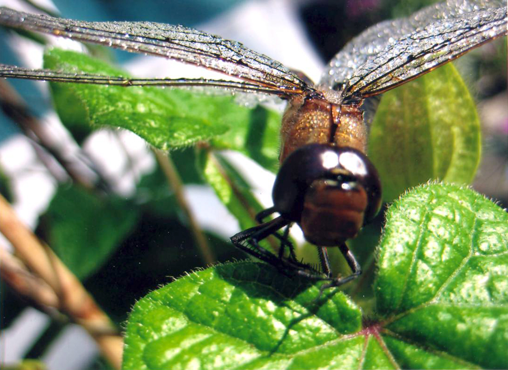
Visitors in the Garden
2nd Place - Silina Nakatsu
The dragonfly is placed very well in the frame, with the body off centre and the wings high to give an impression he could take flight at any moment. The clarity of detail in the leading edges of the wings is a very strong feature. The image would have been even stronger if the dragonfly’s head was in sharp focus as well: the photographer may want to try manually adjusting the settings to a higher f/stop to increase the depth of field.

Visitors in the Garden
3rd Place - Linda Turnbull
Having the statue nestled into the foliage this way creates a sense of intimacy and seclusion in this image. Notably, the two long branches that enter from the lower left corner make a natural frame for his face and add a dynamic element to the composition. The rich greens and dark shadows accentuate the brighter tones in the statue. The insect on his “hair” is a bit distracting (though he is technically another “visitor in the garden!”) and its absence would have made this photograph even stronger.

Garden Colour - Purple
1st Place - John Simmer
This image has the feel of selective colouring, with the delicate purple flower floating on an almost monochrome sea of fascinating whorls and tiny tendrils. The flower is placed very well in the frame, and there is ample interest in the shapes and textures of the background. If the photographer had the opportunity to do some minor photo-editing, cloning
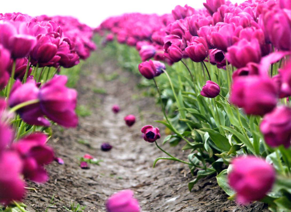
Garden Colour - Purple
2nd Place - Trudy Findlay
A very strong image of a tulip field, with the visual line leading wonderfully into the distance at a very pleasing angle. The photographer chose a perfect f/stop here to create a very shallow depth of field. The tulip that is leaning into the pathway to “look back at us” adds a huge element of interest for this image, and having that blossom in perfect focus is well planned and executed. The bloom at the very bottom of the image is a slight distraction in an otherwise very fluid composition: a slight crop to take out that blossom and a little of the right margin may make this photograph even stronger.

Garden Colour - Purple
3rd Place - Linda Turnbull
A rich tapestry of luscious colours and light make this image very interesting indeed. The berries take on a translucence that is quite captivating, the splashes of yellow make a lovely accent, and the clusters of berries are well positioned. The two overexposed leaves in the middle and top of the frame are a bit of a distraction in an otherwise very well exposed scene. Although difficult to control lighting in a natural environment, sometimes some judicious shading with your hand or the like can reduce light where you want to change it.