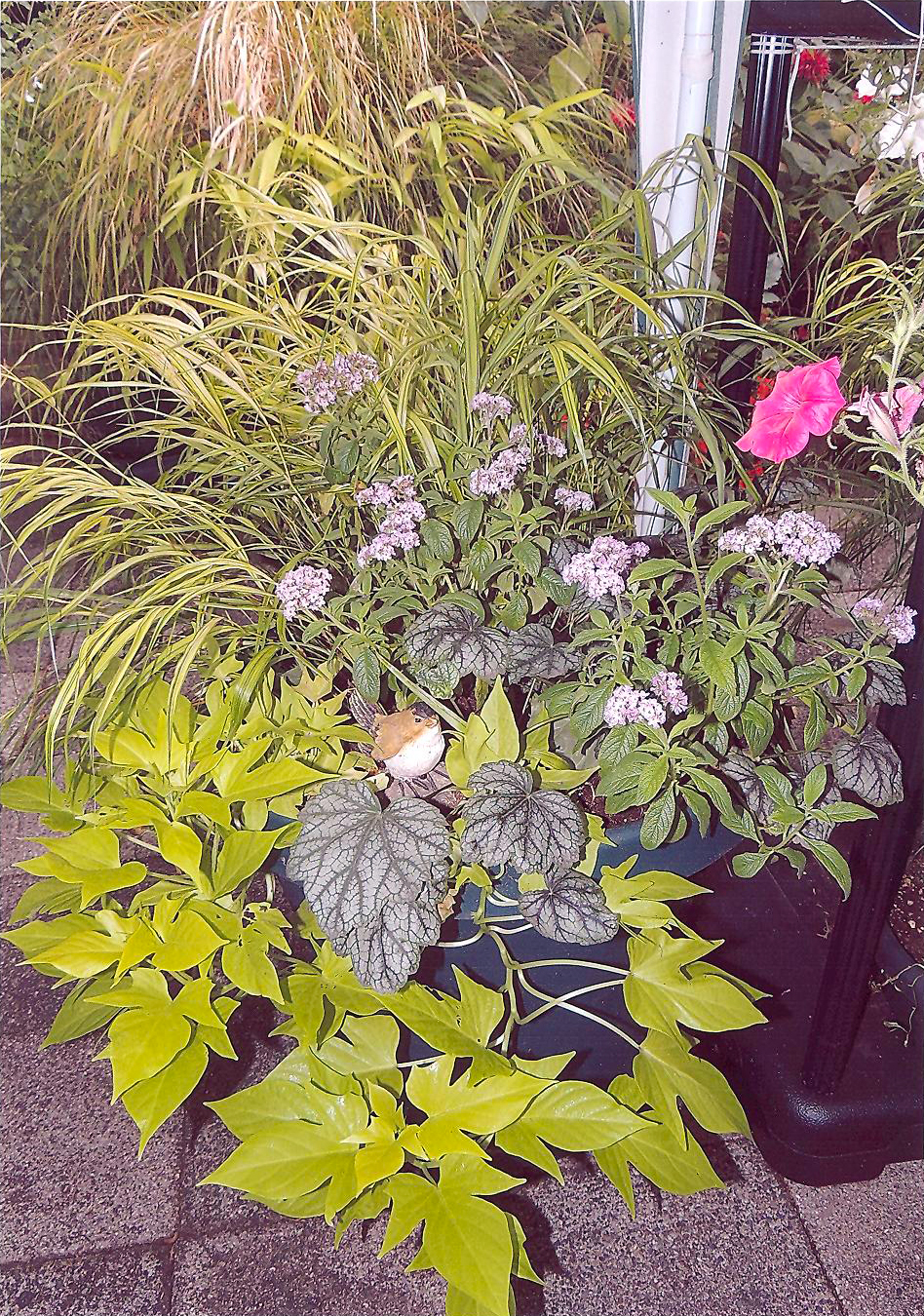
Container Contest
1st Place - Audrey Barnes
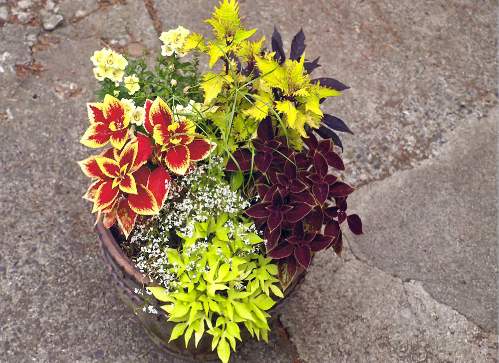
Container Contest
2nd Place - Diane Escalante
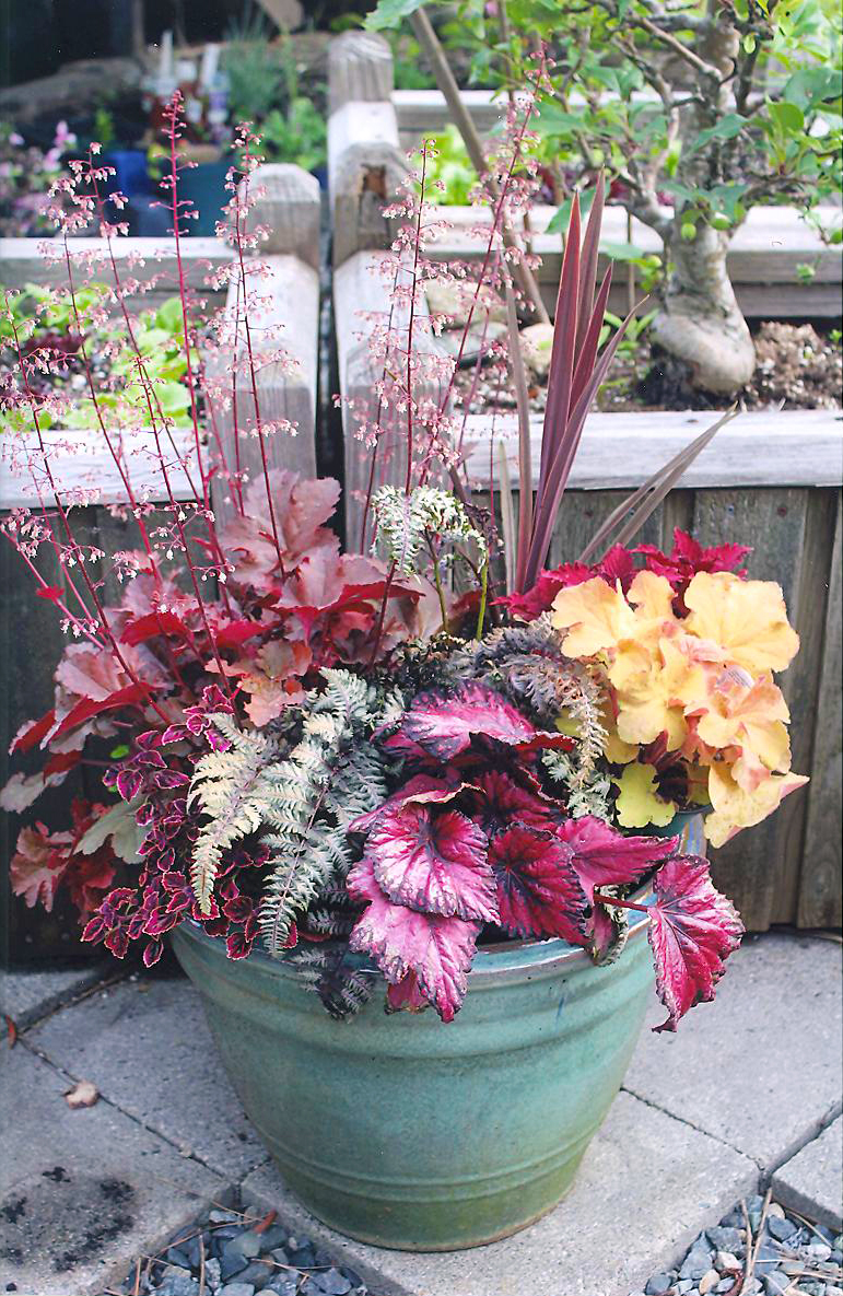
Container Contest
3rd Place - Linda Turnbull
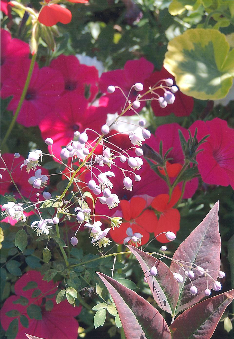
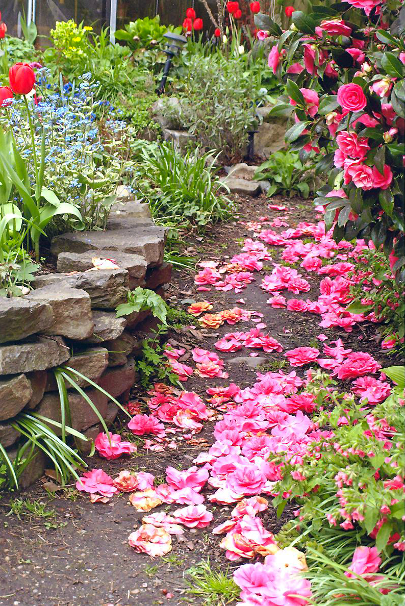
View of a Garden
1st Place - Linda Turnbull
A wonderful, vibrant colour palette, and good interest to the background with the colours and shades making a pleasing pattern to the eye. There is very good separation of the white blooms from the background which makes a nice visual focus. Good light control and depth of field. A well shot image.

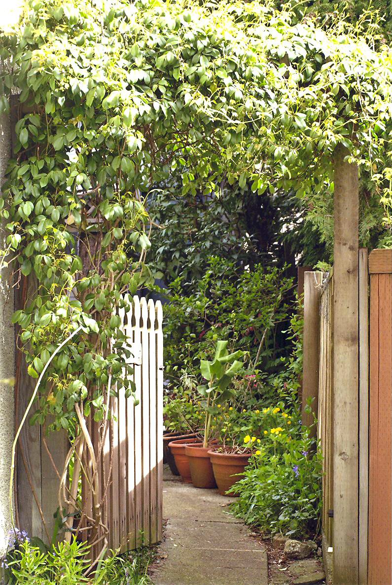
View of a Garden
2nd Place - Diane Escalante
Very pleasing colours are the strongest feature of this image, and there is an interesting interaction of the patterns of yellow intersecting purple in the main group of blooms. Touches of red amongst the green in the background also create interest

View of a Garden
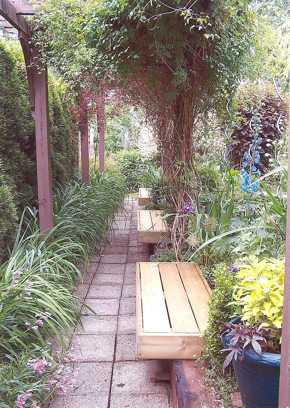
3rd Place - Jacqueline Shephard
The photographer has used the arbor and pathway to good advantage here, creating a visual flow from the bottom left corner, and taking the observer right into the frame. Some more colour in the foliage would be a great addition, and I would be very interested in seeing this same shot taken at different times of the year. The mid-day light is sometimes a little harsh, and if the photographer has access to a polarizing filter that can reduce the reflections on the leaves and make the greens richer and deeper. Nonetheless a well-planned and pleasing image.
Garden Design
1st Place - Linda Turnbull
Garden Design
1st Place - Diane Escalante
Garden Design
3rd Place - Diane Escalante
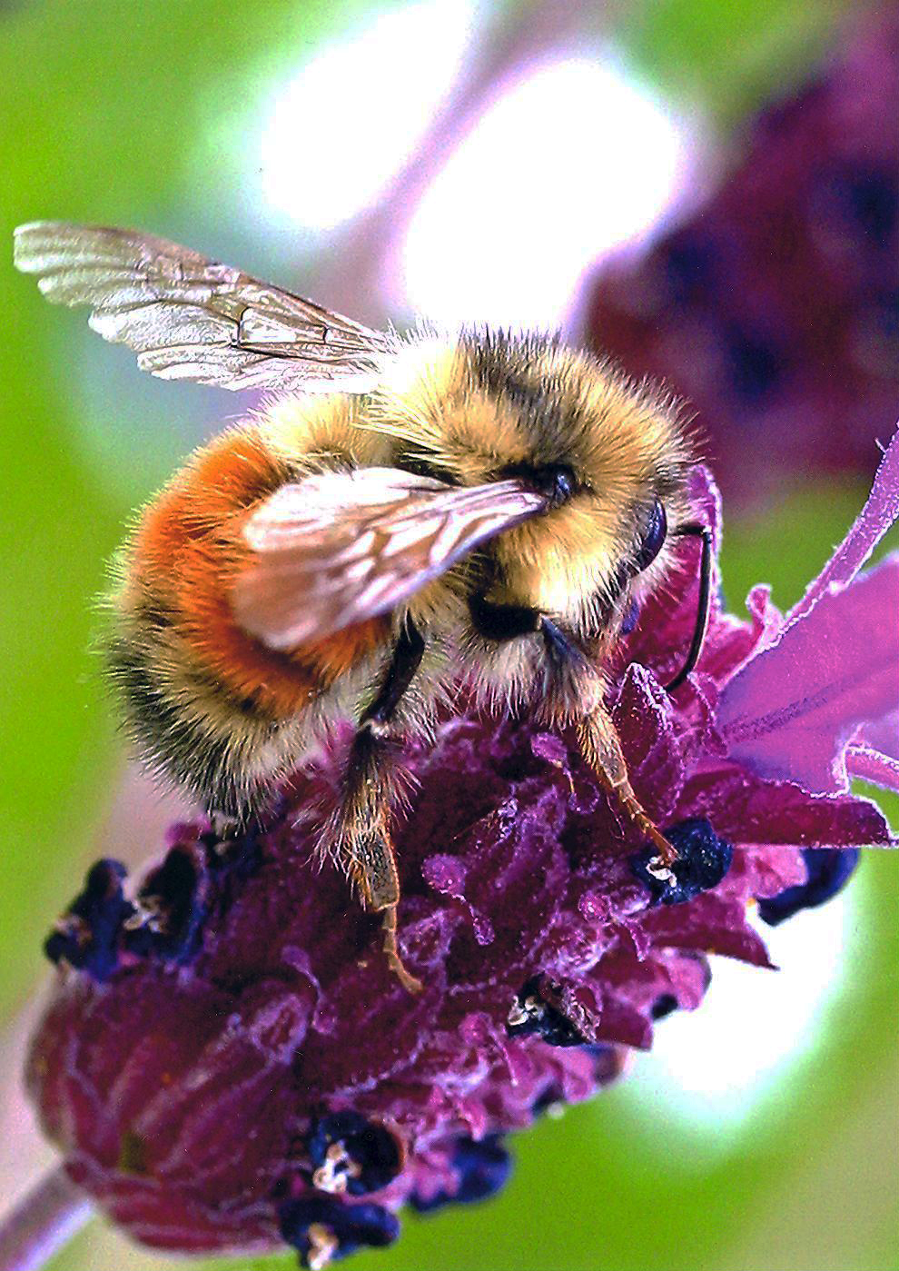
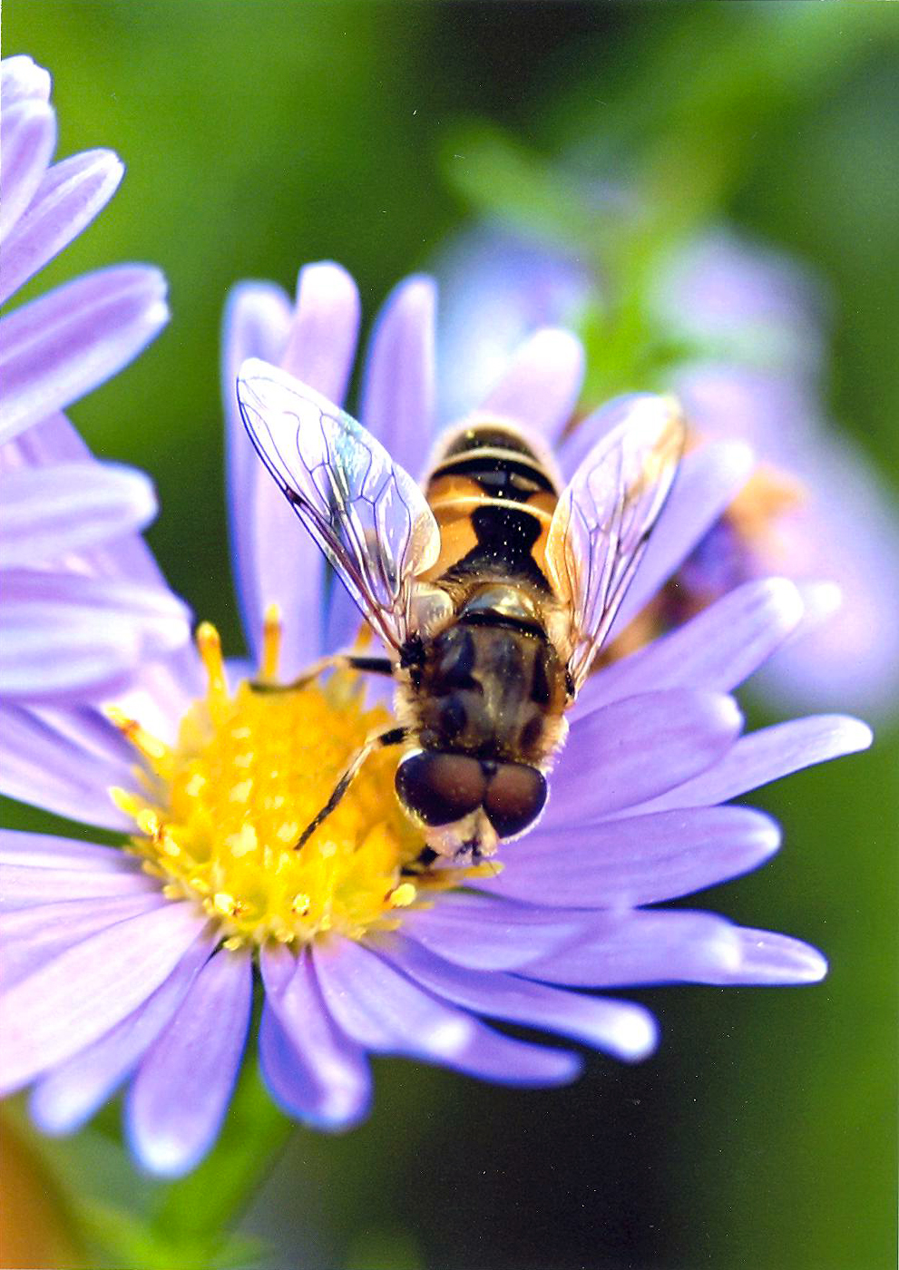
Visitors in the Garden
1st Place - Gillian Escalante
This image has so much going for it… exceptional clarity, intricate details and a highly dynamic composition with the bee and blossom pointing up, up and away! Other features I appreciate in the composition include the way the stem is tucked perfectly into the corner, and the fact that there’s space above the bee to give him room to “move” in the observers’ mind. Top notch macro!
Visitors in the Garden
2nd Place - Gillian Escalante
Exceptionally sharp details on the bee, and we certainly appreciate the clarity there, but what really gives a dynamic aspect to the frame is the river of purple and yellow that meanders in an undulating pattern deep into the image. This keeps the image from being just an anatomical study of an insect, and makes the observer feel the energy and busy-ness (if you will) of the bee. A nicely put together image.

Visitors in the Garden
3rd Place - Heather Best
A very nice moment with the hummingbird doing what hummingbirds do…. well timed. The slight blur and glow to the wings really gives us a sense of motion, and the rest of him is fairly sharp as it should be. The image would be even stronger if the flowers and leaves weren’t clipped in the frame as they are, but of course these subjects don’t always cooperate in their poses: it remains an engaging image as it is.
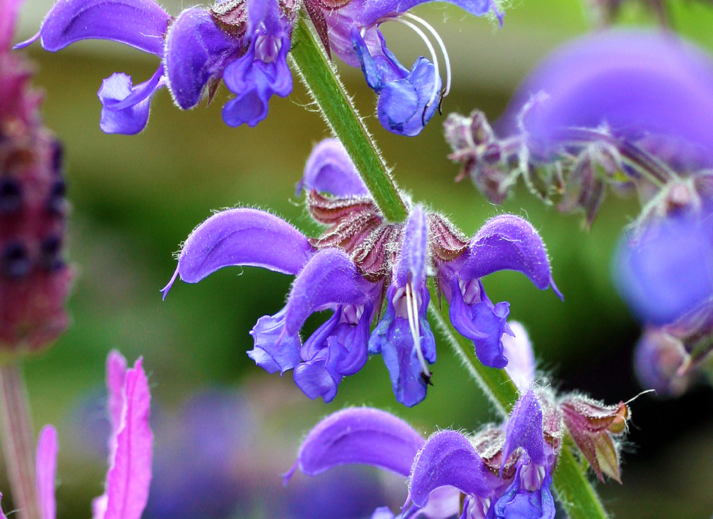
Garden Colour - Blue
1st Place - Gillian Escalante
Vivid and Dynamic are certainly the first words that come to mind in describing this vibrant image. The main flower stem placed diagonally across the frame was a very good choice. There is also a pleasing mixture of clarity and blur to the surroundings that isolates the subject and makes an excellent visual focus. The sharpness of detail on the tiny hairs is another strong feature that keeps the eye engaged. Very well done!
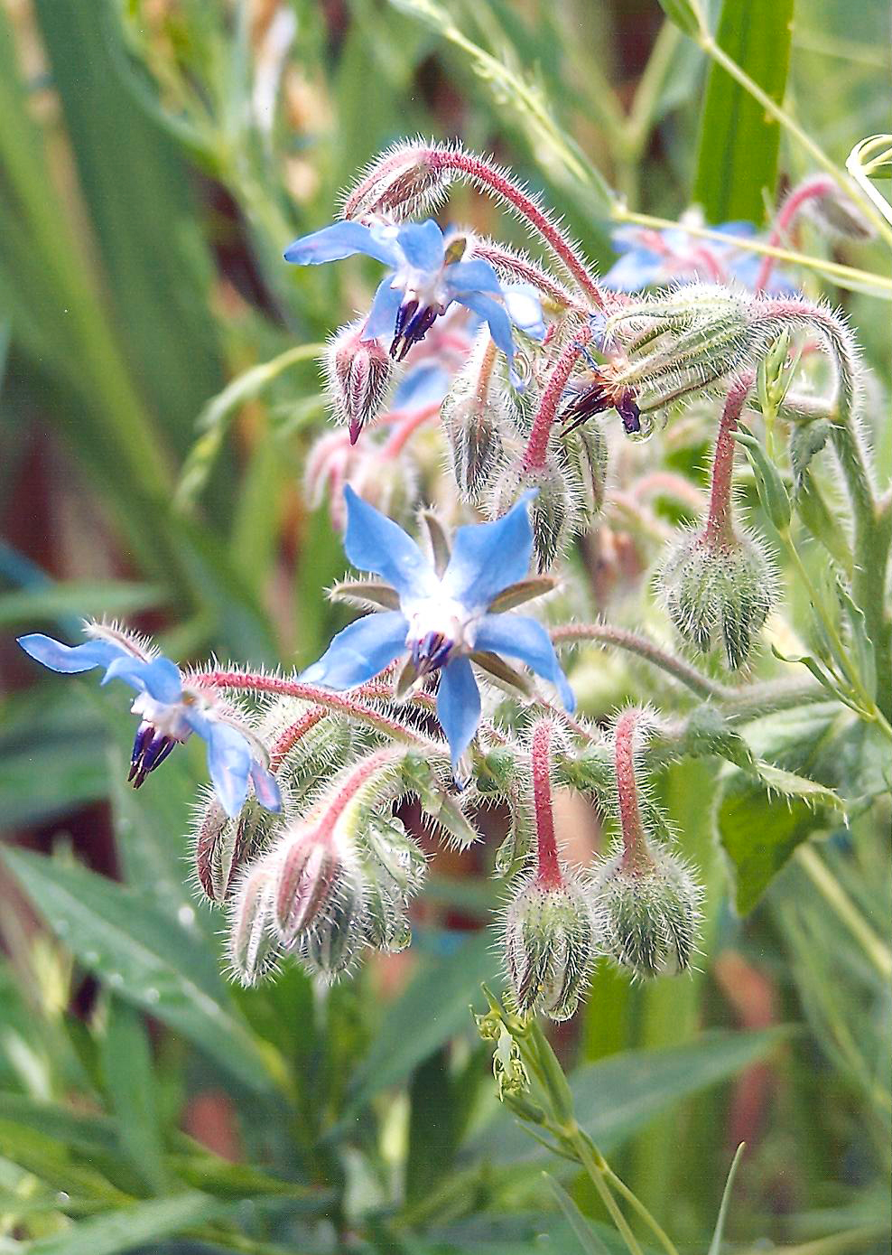
Garden Colour - Blue
2nd Place - Linda Turnball
This image feels delicate and refined: the muted colours and tiny details all contribute to a subtle but interesting image. The blooms all facing the same way gives some flow to the composition, and the sharpness in the fine details adds interested everywhere we look. The small stem at the bottom right of the frame is a little out of place and distracts somewhat from the free-floating isolation from the background, but nonetheless this is a strong image.
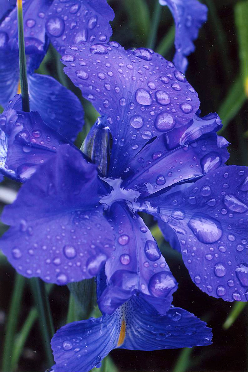
Garden Colour - Blue
3rd Place - Audrey Barnes
A beautiful display of deep colour, and water droplets add so much interest to flower pictures. There is a nice flow to the composition top to bottom, and good light control. If these blooms had a bit more of the yellow streak that the bottom one does, there would be even stronger visual interest throughout the frame, but a very pleasing image as it is.